library("bslib")
library("bsicons")
library("sf")
library("tidyverse")

bee_data <- readr::read_csv("bee_data.csv")
states_shp <- readr::read_rds("us_states_shp.rds")

color_1 <- "#E77500"
color_2 <- "#121212"Interactive Dashboards
In this workshop, we will explore the relatively new technology called Quarto dashboards. In this exploration, I have chosen a different data set per my interest, but much of the credit for the design of this workshop goes to the folks at Posit and other data scientists who have already created wonderful tutorials (see Additional Resources). Furthermore, we will incorporate interactive elements into our dashboards using shiny. I will introduce the materials and invite you to try out some of the steps on your own (here: in Zoom breakout rooms)
About the Presenter
Derek Sollberger is a lecturer with CSML (Center for Statistics and Machine Learning) where he teaches Data Science and Bayesian Analysis. He has led several R programming workshops with ESL (Engineering Service Learning) and is a Posit Certified Tidyverse Instructor. Here he brings experience from acting as a data analysis consultant for several research projects in pedagogy.
Dashboards
It may be a good idea to get a sense of what we mean by “dashboards”. Let us spend a few minutes looking at a couple of examples from the Posit websites.
- Examples from Posit
Libraries
Posit Cloud
For our convenience here in this workshop, you will be directed to [fork] a workspace in Posit Cloud. That is, we have supplied the data sets, image files, and code libraries in advance.
Case Study: Bees!
Concern for Bee Populations
Data Source
Our data come from the Quick Stats at USDA NASS (United States Department of Agriculture National Agricultural Statistics Service). Users can access a subset of the data through dropdown menus. For replicability, I list my selections below:
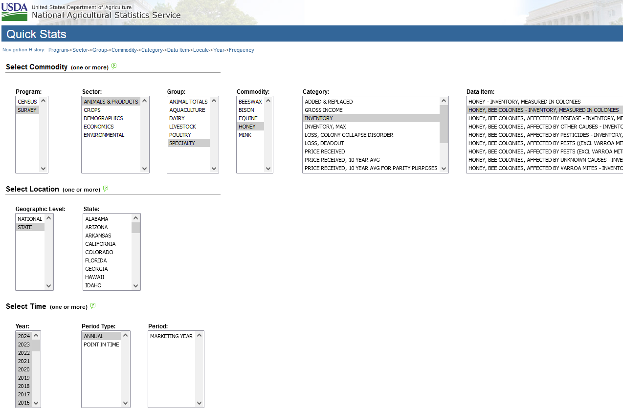
Commodity:
- Program: SURVEY
- Sector: ANIMALS & PRODUCTS
- Group: SPECIALTY
- Commodity: HONEY
- Category: INVENTORY
- Data item: HONEY, BEE COLONIES - INVENTORY, MEASURED IN COLONIES
Location:
- Geographic Level: STATE
- State: [leave unselected for all states]
Time:
- Year: [selected 2014 to 2024 to obtain about a decade of data]
- Period Type: ANNUAL (note: the “annual” measurements were done by each state, while other granularity might not be available for all states)
- Period: MARKETING YEAR
Bar Charts
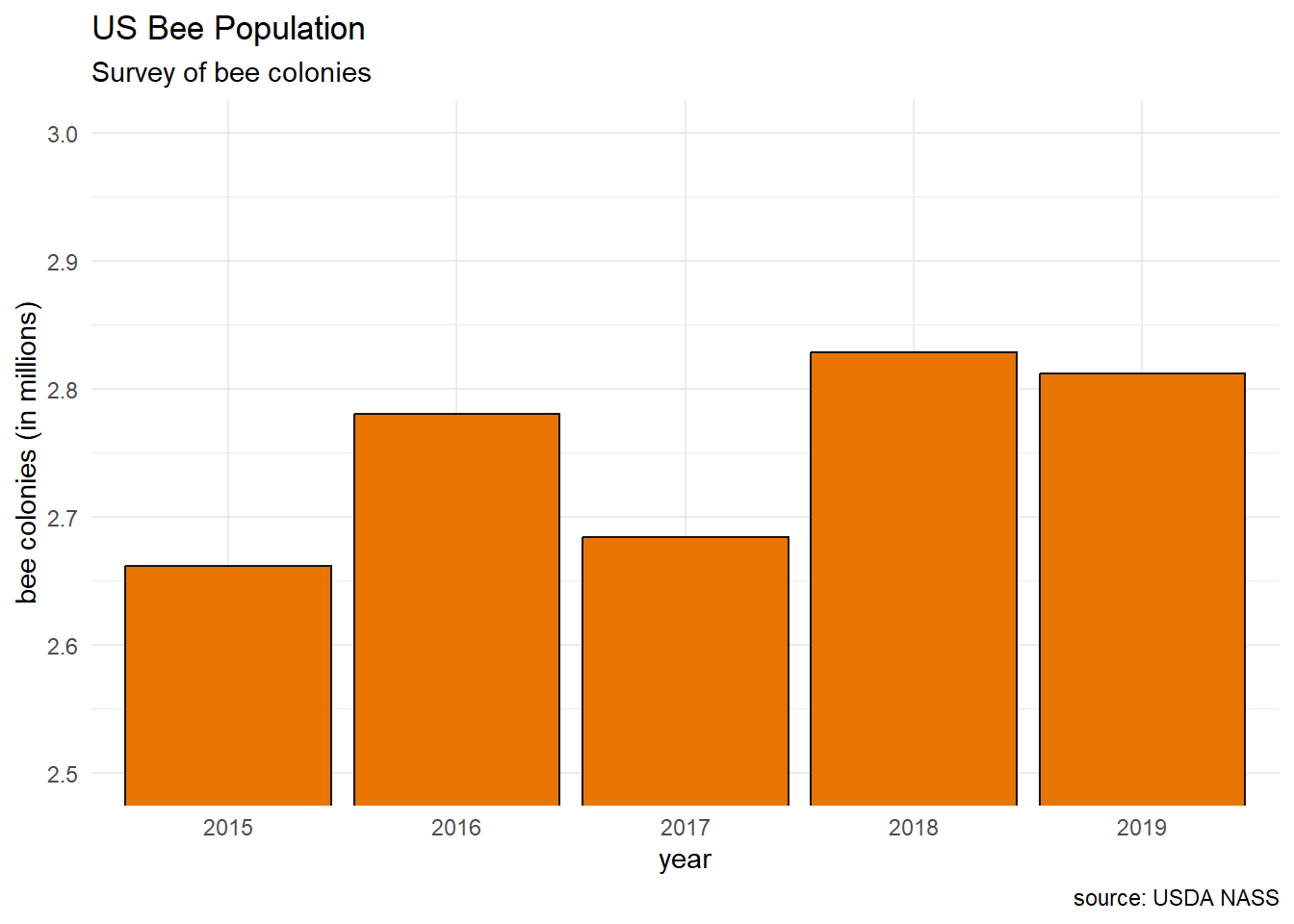
bee_data |>
  group_by(Year) |>
  mutate(total_colonies = sum(Value)) |>
  ungroup() |>
  select(Year, total_colonies) |>
  distinct() |>
  mutate(num_colonies = total_colonies / 1e6) |>
  ggplot(aes(x = factor(Year), y = num_colonies)) +
  geom_bar(color = "#121212", fill = "#E77500",
           stat = "identity") +
  coord_cartesian(ylim = c(2.5,3.0)) +
  labs(title = "US Bee Population",
       subtitle = "Survey of bee colonies",
       # caption = "source: USDA NASS",
       x = "year",
       y = "bee colonies (in millions)") +
  theme_minimal()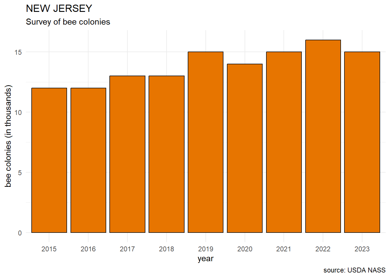
nj_plot <- bee_data |>
  filter(State == "NEW JERSEY") |>
  mutate(num_colonies = Value / 1e3) |>
  ggplot(aes(x = factor(Year), y = num_colonies)) +
  geom_bar(color = "#121212", fill = "#E77500",
           stat = "identity") +
  labs(title = "NEW JERSEY",
       subtitle = "Survey of bee colonies",
       caption = "source: USDA NASS",
       x = "year",
       y = "bee colonies (in thousands)") +
  theme_minimal()

nj_plot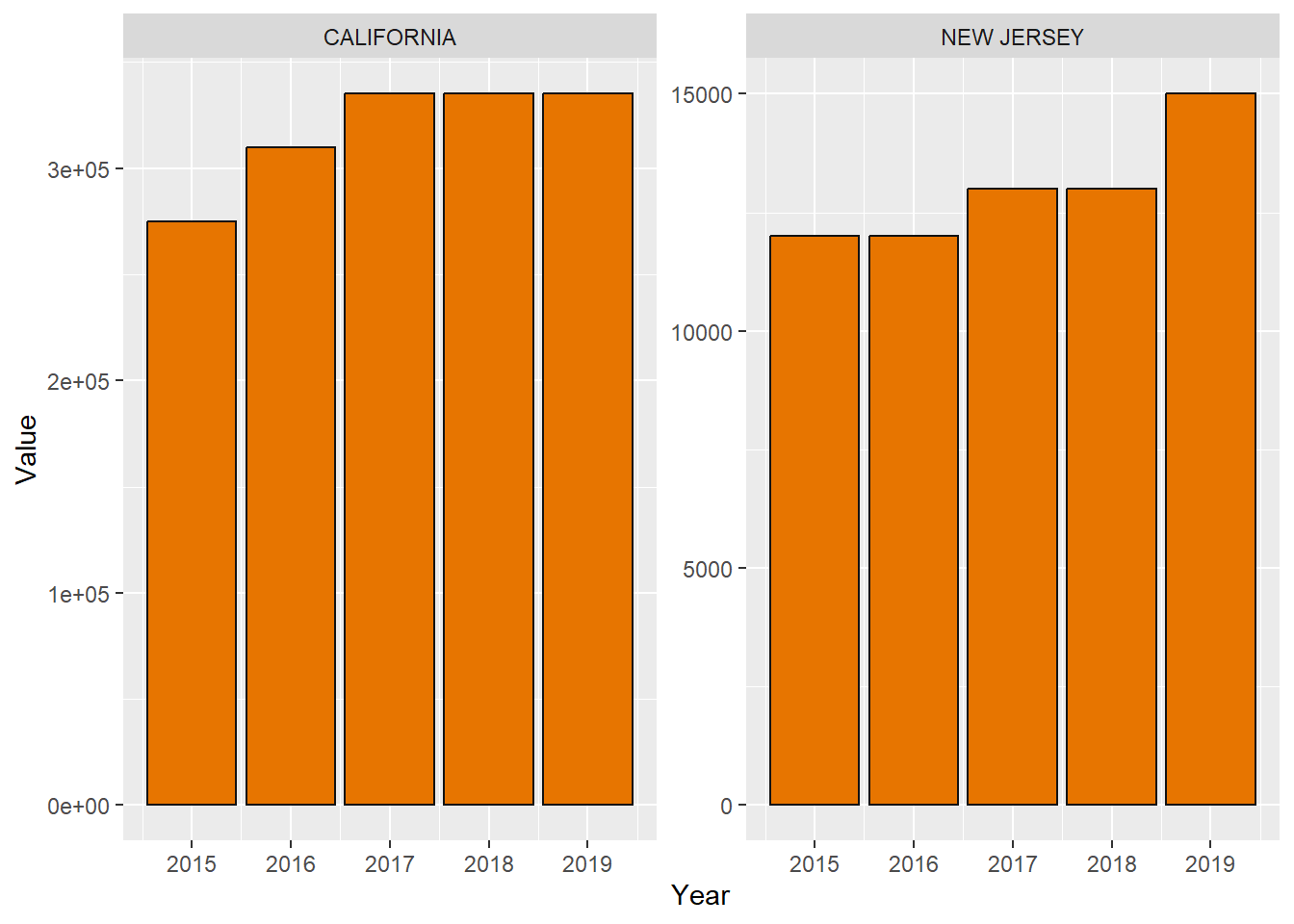
bee_data |>
  filter(Year >= 2015 & Year <= 2019) |>
  filter(State %in% c("CALIFORNIA", "NEW JERSEY")) |>
  ggplot(aes(x = Year, y = Value)) +
  facet_wrap(vars(State), scales = "free_y") +
  geom_bar(color = "#121212", fill = "#E77500", stat = "identity")
Maps
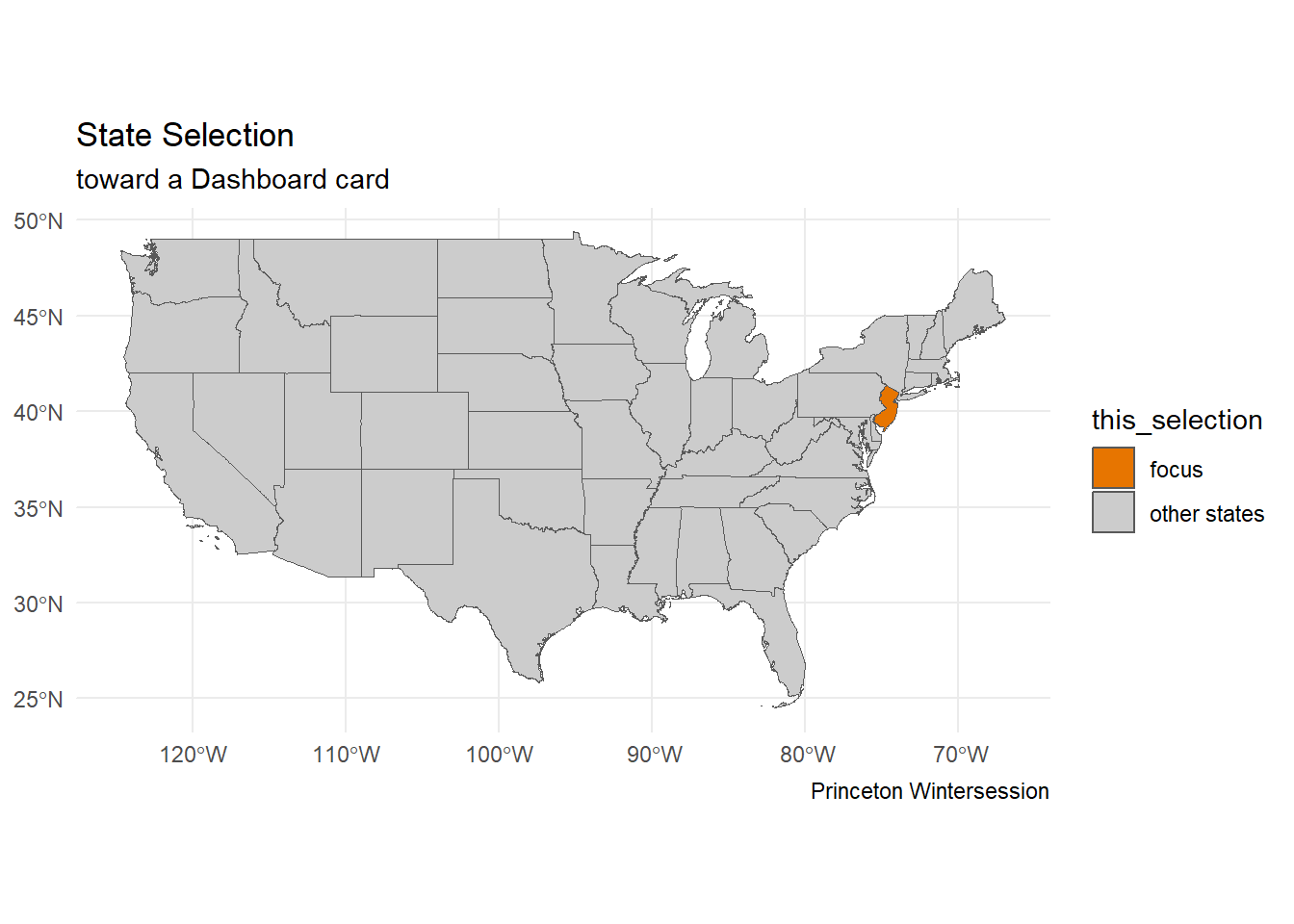
states_shp |>
  mutate(this_selection = ifelse(NAME == "New Jersey",
                               "focus", "other states")) |>
  ggplot() +
  geom_sf(aes(fill = this_selection)) +
  labs(title = "State Selection",
         subtitle = "toward a Dashboard card",
         caption = "Princeton Wintersession") +
  scale_fill_manual(values = c(color_1, "gray80")) +
  theme_minimal()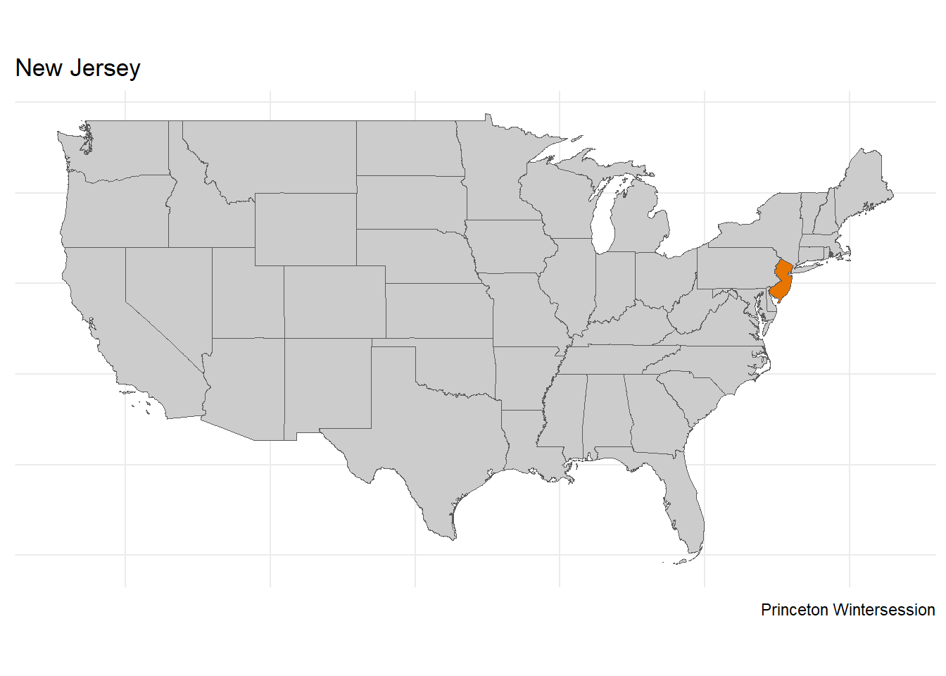
nj_map <- states_shp |>
  mutate(this_selection = ifelse(NAME == "New Jersey",
                               "focus", "other states")) |>
  ggplot() +
  geom_sf(aes(fill = this_selection)) +
  labs(title = "New Jersey",
         # subtitle = "toward a Dashboard card",
         caption = "Princeton Wintersession") +
  scale_fill_manual(values = c(color_1, "gray80")) +
  theme_minimal() +
  theme(axis.title.x = element_blank(),
        axis.text.x  = element_blank(),
        axis.ticks.x = element_blank(),
        axis.title.y = element_blank(),
        axis.text.y  = element_blank(),
        axis.ticks.y = element_blank(),
        legend.position = "none")

nj_map
Setup (YAML and QMD)
In a Posit Cloud session, create a new Quarto document, and then change the format to dashboard.
---
title: "My Dashboard"
format: dashboard
---

# notebook content goes here...
Cards
Each additional visible object is arranged into the dashboard as a card.
Layout
Rows
By default, the arrangement of the cards is in rows.
Columns
The default settings use
- first-level headers (
#) for tabs - second-level headers (
##) for rows - third-level headers (
###) for columns
Orientation
To change the arrangements into columns, change the YAML header
format:
  dashboard:
    orientation: columns
More specifically, our file will use
- first-level headers (
#) for tabs - second-level headers (
##) for columns - third-level headers (
###) for rows
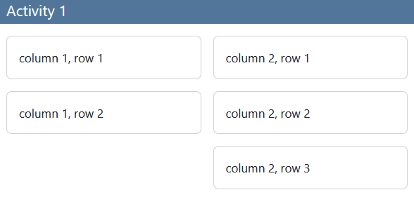
Activity 1
Create a new Quarto document whose YAML
- creates a
dashboard
- includes
orientation: columns
- creates a
Form a layout with
- 2 columns
- 2 rows in the first column, 3 rows in the second column
Prototype Content
Let us now place some content into the cards (as placeholders) to see how our plans are faring. We will be starting from template_1.qmd.
Plots
As usual in R, we can have code chunks that display plots. Observe that we have loaded some objects into the environment such as bee_data.
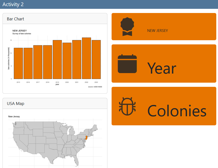
For starters, we can put a code chunk into the first card (column 1, row 1) that displays the nj_plot.
nj_plotEach card used this way can be given a title. We can add a title to a card using the #| title: code chunk in Quarto markdown.
Value Boxes
To emphasize certain words or numbers in the dashboard, we can use valueboxes. For example, let us place a valuebox into the top-right card (column 2, row 1) that simply says a state name for now.
::: {.valuebox icon="award-fill" color="#E77500"}
NEW JERSEY
:::
Of importance, for a valuebox to appear and function as intended, the R code needs to output a value.
Activity 2
Starting from
template_1.qmdPlace
nj_mapinto the bottom-left card (column 1, row 2)- give this card a title
Create two more valueboxes
- feel free to use different icons and colors
Interactive Content
Now we aim to offer interactivity to the user.
Shiny
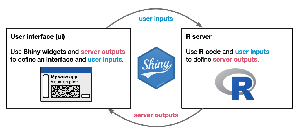
- image source: Introduction to Data Science
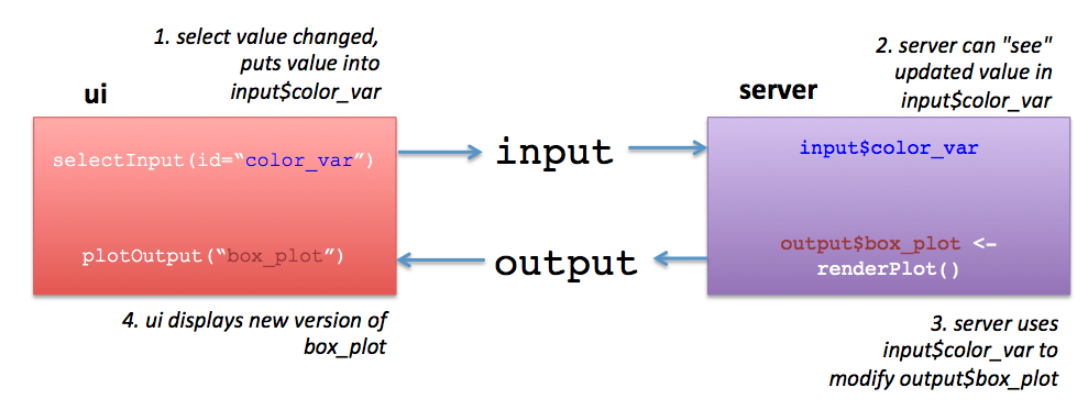
- image source: Ted Laderas
Shiny Dashboard
Some code elements that are paramount here include needing
server: shinyin the YAMLcontext: setupin the first code block (i.e. where you load code libraries)context: serverin the main code block
Server
Now, we need use the shiny framework to perform these computations in a reactive way. Create the following code chunk, and be sure to set #| context: server.
#| context: server
output$state_plot <- renderPlot({
  bee_data |>
  filter(State == input$state_choice) |>
  mutate(num_colonies = Value / 1e3) |>
  mutate(year_color = ifelse(Year == input$year_choice,
         TRUE, FALSE)) |>
  ggplot(aes(x = factor(Year), y = num_colonies)) +
  geom_bar(aes(fill = year_color),
           color = "#121212", ,
           stat = "identity") +
  labs(title = paste0(str_to_title(input$state_choice)),
       subtitle = "Survey of bee colonies",
       caption = "source: USDA NASS",
       x = "year",
       y = "bee colonies (in thousands)") +
  scale_fill_manual(values = c("#121212", "#E77500")) +
  theme_minimal() +
  theme(legend.position = "none")
})


output$state_choice <- renderText({input$state_choice})
Plots
Now we have have the output in place, we can use more shiny code to plot that output. Where the barchart code was intended to be, place the following
plotOutput("state_plot")Valueboxes
Now we have have the output in place, we can use more shiny code to display certain numbers. Inside the valueboxes’ divs, place the following
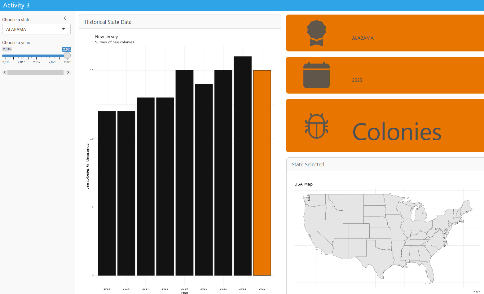
r textOutput("state_choice")Activity 3
Starting from template_2.qmd
server: userenderPloton the code that produces a map from the shapefileserver: userenderTexton theslider_inputvariable to placeyear_choicein theoutputui: usetextOutputto display the user’syear_choice.ui: useplotOutputto show the map (of the contiguous United States)
Data Mining
Fortunately, for this relatively simple app, the usual dplyr verbs work well with our data. Just remember when to call variables from the input selections. For example, when the user makes their choice among the states, the result is stored in input$state_choice, and we can use it in filter:
bee_data |>
  filter(State == input$state_choice)
Activity 4
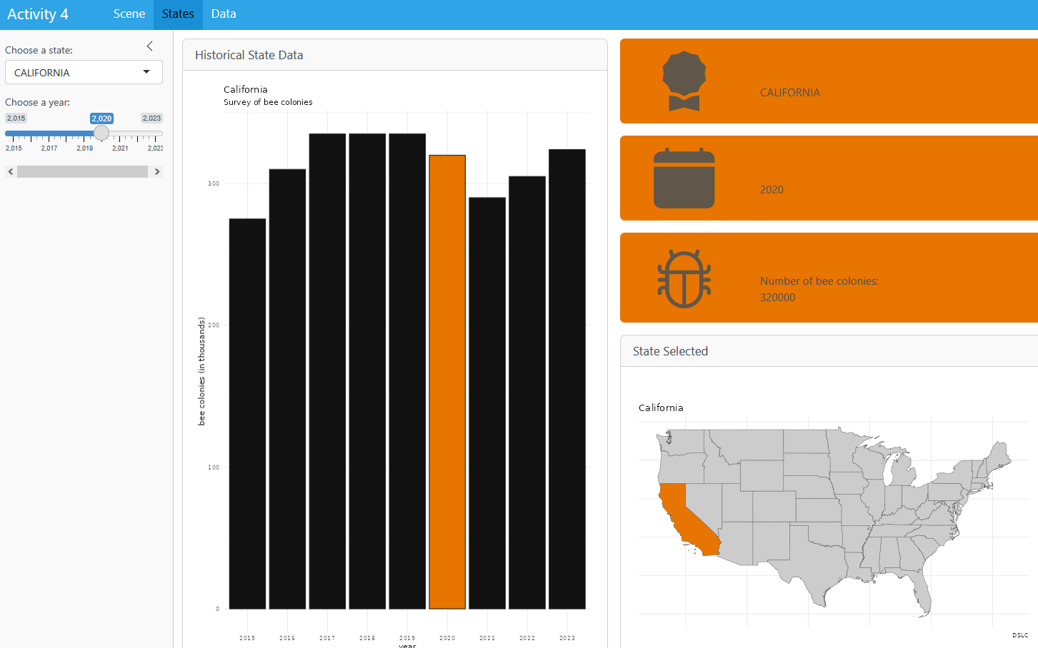
Starting from template_3.qmd, try to implement the following in your interactive Quarto dashboard:
- allow the user’s
year_choiceto affect which bar is highlighted in the bar graph - allow the user’s
year_choiceto affect which state is highlighted in the state map - correctly restate the number of bee colonies for the user’s selections of state and year.
- rename the document from “Activity 4” to “Bee Dashboard”
Epilogue
Congratulations on making your interactive Quarto dashboard.
If you have comments—especially on how to expand this workshop—please let me know!
Additional Resources
For this workshop, I followed the materials presented by Mine Cetinkaya-Rundel and Posit
Folks that are interested in learning more about Quarto Dashboards can refer to resources such as the following:
How to Automate your Reporting by Isabella Velasquez
Easy Dashboards by The GRAPH Courses
Interactive Infographic using DisplayR by Melisaa Van Bussel
Quarto Dashboards by Charles Teague
Quarto Dashboards by Isabella Velasquez
How to Style your Quarto docs without HTML & CSS by Albert Rapp
Beyond Dashboards by Sean Nguyen