At first, I thought that I could reasonably type in all of the data, but Bonds’ career was quite long. I copy-and-pasted the batting table from Baseball Reference and focused on the Year and IBB columns.
The franchise page for the Tampa Bay Rays did not have intentional walks quickly accessible, so I simply went through the year-by-year pages and gathered the IBB total (fortunately easy to find visually as the last column).
While I could probably affect the horizontal axis later in a ggplot visualization, I prefer today to have the data in one data frame. Let me merge the data.
df <- df_bonds |>full_join(df_rays, by ="Year") |>rename("IBB_Bonds"="IBB.x","IBB_Rays"="IBB.y")
The naturally missing values probably would not affect the calculations much, but for peace of mind, let us impute those values to be zeroes.
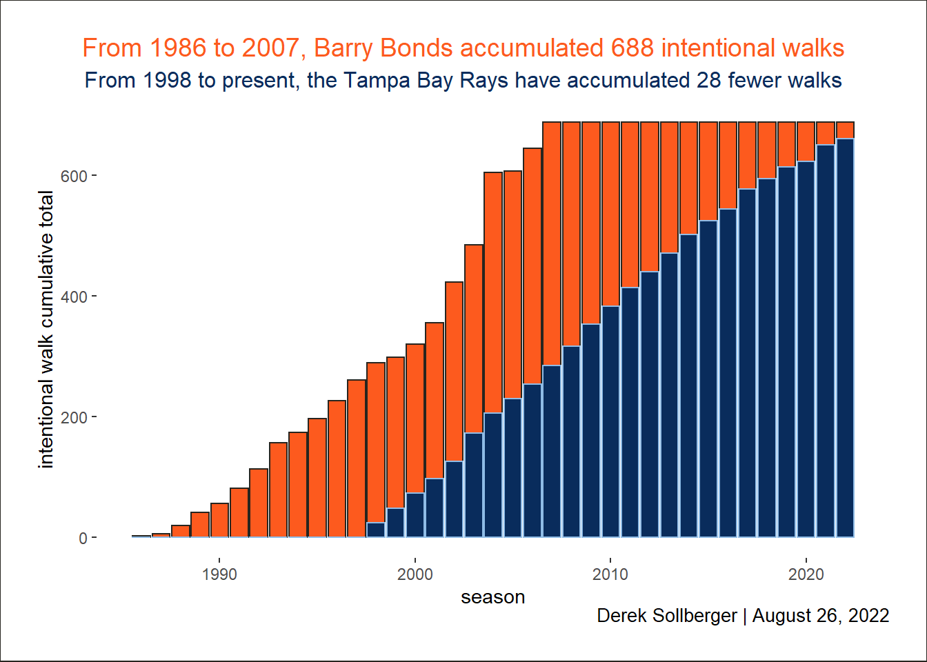
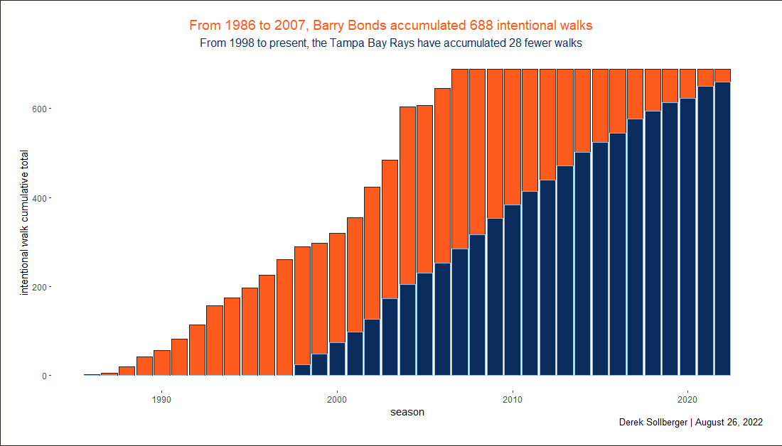
While line graphs (with areas filled) would probably be the most visually appealing, it might be better to treat seasons as discrete entries in a bar plot.
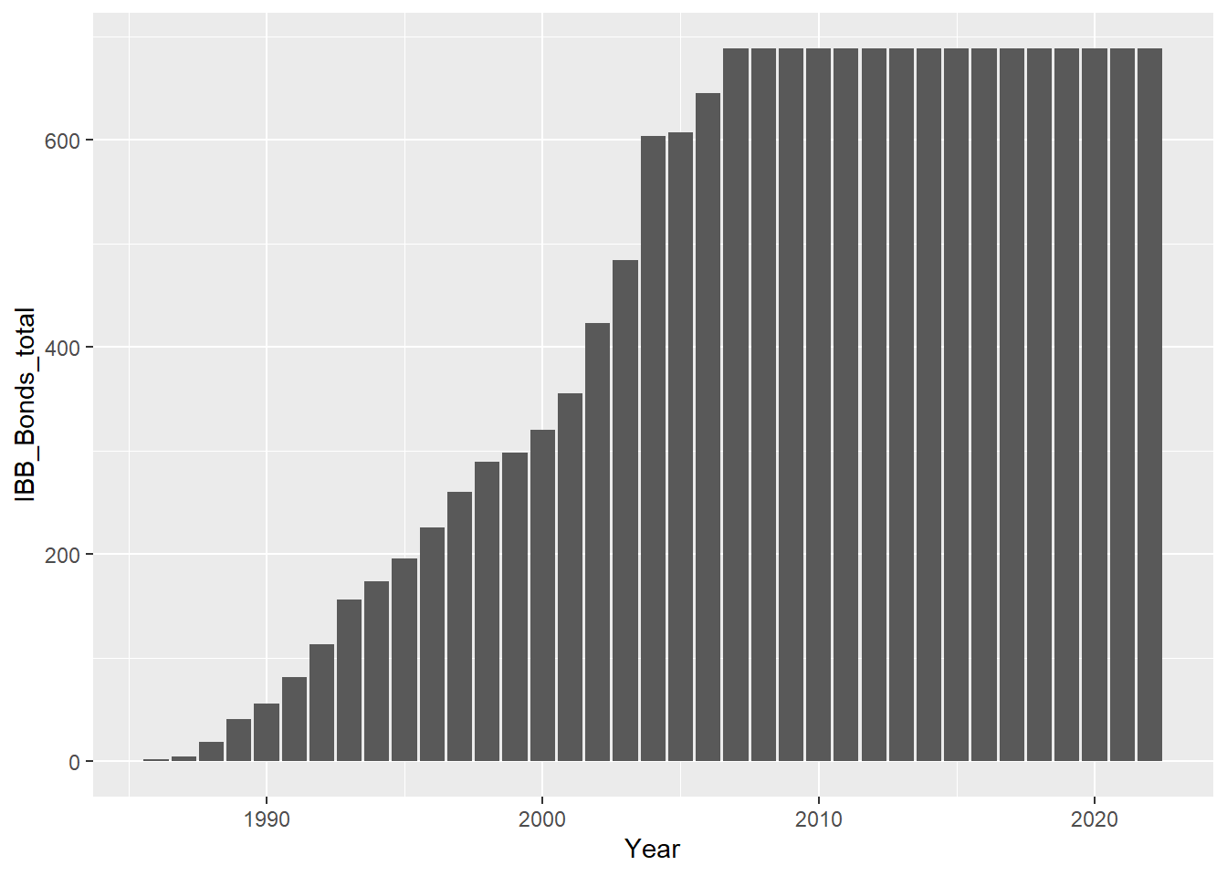
df |>ggplot() +geom_bar(aes(x = Year, y = IBB_Bonds_total),stat ="identity")
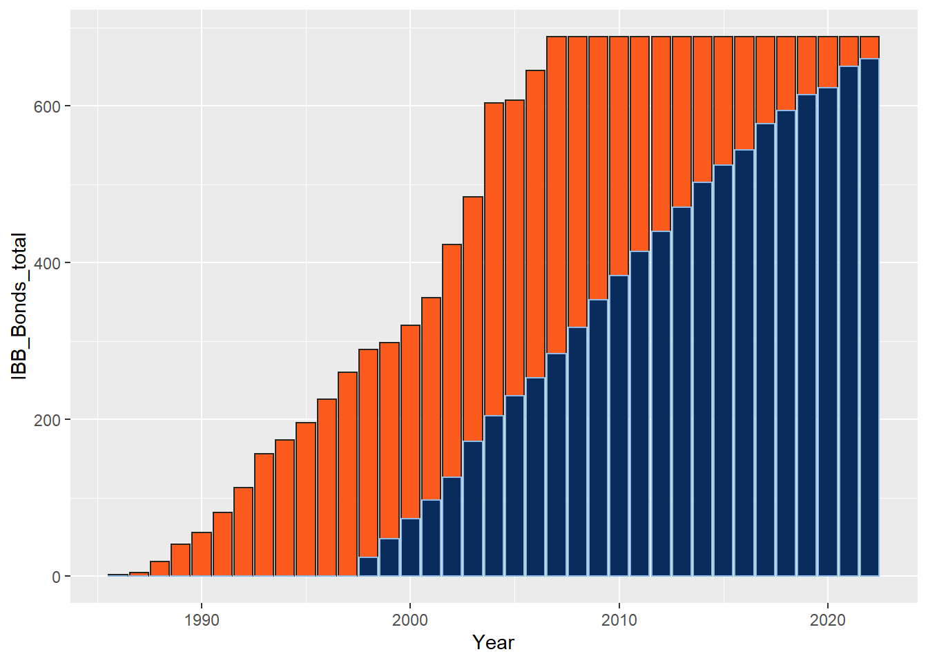
Now I am curious what the bars will look like in team colors.
baseplot <- df |>ggplot() +# https://teamcolorcodes.com/san-francisco-giants-color-codes/geom_bar(aes(x = Year, y = IBB_Bonds_total),color ="#27251F", fill ="#FD5A1E",stat ="identity") +# https://teamcolorcodes.com/tampa-bay-rays-color-codes/geom_bar(aes(x = Year, y = IBB_Rays_total),color ="#8FBCE6", fill ="#092C5C",stat ="identity")# printbaseplot
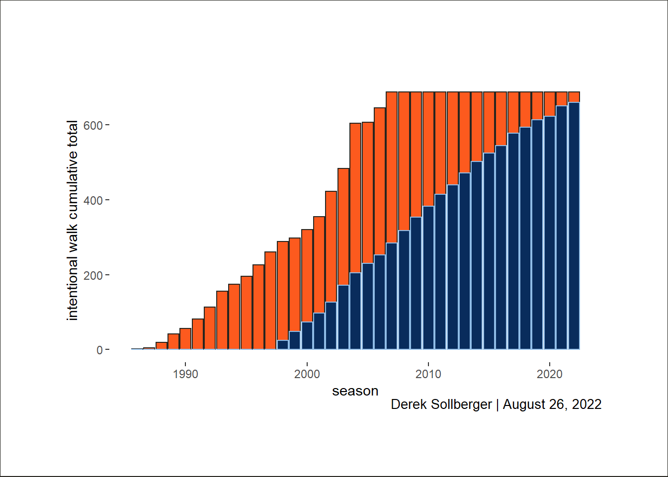
Moving toward aesthetic beauty, I will update some of the theme elements.
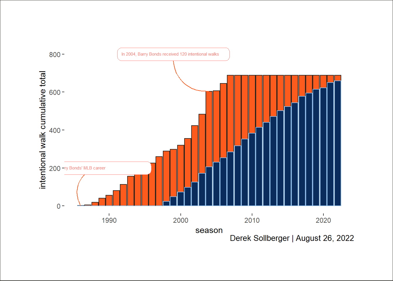
Now, I am going to attempt to add arrows (and later: labels) to highlight certain areas of the graph. This is still very new to me, so fingers crossed.
current_plot +# In 2004, Barry Bonds received 120 intentional walksannotate(color ="#FD5A1E",geom ="curve",size =0.5,x =1999, xend =2004,y =800, yend =604) +geom_textbox(aes(x =1999, y =800,color ="#000000",label ="In 2004, Barry Bonds received 120 intentional walks"),size =2) +# Start of Barry Bonds' MLB careerannotate(color ="#FD5A1E",geom ="curve",size =0.5,x =1988, xend =1986,y =200, yend =0) +geom_textbox(aes(x =1988, y =200,color ="#000000",label ="Start of Barry Bonds' MLB career"),size =2)
# print# current_plot
At the moment, I am having difficulty getting labels to naturally appear beyond the panel.
Instead, I will focus on the title and caption.
# some ideas from# https://github.com/nikopech/TidyTuesday/blob/master/R/2022-08-09/2022_08_09_ferris_wheels.Rcurrent_plot <- baseplot +labs(title ="From 1986 to 2007, Barry Bonds accumulated 688 intentional walks",subtitle ="From 1998 to present, the Tampa Bay Rays have accumulated 28 fewer walks",caption ="Derek Sollberger | August 26, 2022",x ="season",y ="intentional walk cumulative total") +theme(legend.position ="none",panel.background =element_blank(),plot.background =element_rect(fill ="#FFFFFF", color ="#27251F" ),plot.title =element_text(color ="#FD5A1E", size =14, hjust =0.5),plot.title.position ="plot",plot.subtitle =element_text(color ="#092C5C", size =12, hjust =0.5),plot.caption =element_markdown(margin =margin(t =0), size =10),plot.caption.position ="plot",plot.margin =margin(20, 20, 20, 20))# printcurrent_plot